Tips & resources, REcent work, stories & guides
The
WANDERLUXE
JOURNAL
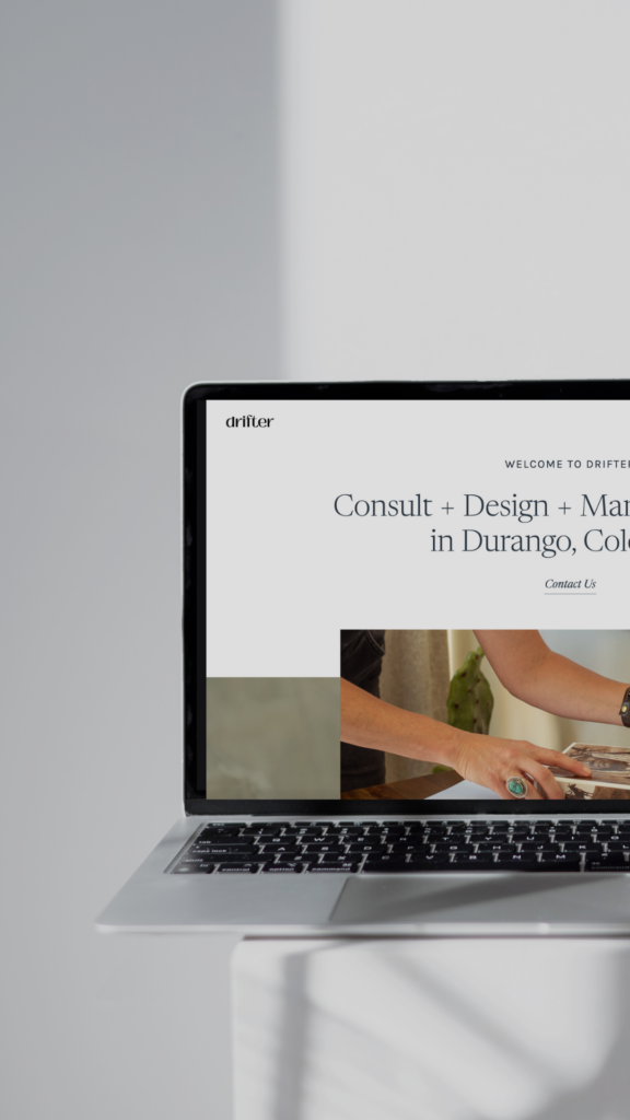
If you’re stepping into Showit for the first time, you’re in the right place.
At Wanderluxe Studio, Showit is one of our go-to website builders for creative entrepreneurs, brands, and storytellers who want complete design freedom without the tech overwhelm. Whether you’re launching with a free template or a custom design, understanding the core tools inside Showit will completely change how confident and capable you feel building your site or simply making edits.
This guide walks you through the foundational features you’ll use again and again, so you can design with intention, ease, and clarity.
What You’ll Learn Inside This Guide
This walkthrough covers the essentials, including:
- How to confidently navigate the Showit interface
- The difference between pages, site canvases, and page canvases
- How to update fonts and brand colors site-wide
- Why canvas sets are such a powerful time saver
- How to manage galleries, blog templates, mobile design, and more
This tutorial is ideal for:
- Creative entrepreneurs building their first Showit website
- Business owners who want control over their own updates
- Designers looking for a clear refresher on Showit’s layout and functionality
Let’s dive into what makes Showit such a powerful (and fun) platform to work in.
Getting Familiar with the Showit Interface
Once you log into Showit and open your template, you’ll notice a few key areas right away:
- Desktop and mobile previews at the top
- A left-hand sidebar containing Pages, Blog Templates, Site Canvases, and Canvas Sets
Here’s how those pieces work together:
- Pages are your main website pages (Home, About, Services, Contact, etc.)
- Blog Templates control the design of your WordPress blog
- Site Canvases are reusable sections that sync across your site
- Canvas Sets are grouped canvases that you can apply all at once
Once this structure clicks, everything else in Showit becomes much easier to navigate.
Pages: The Backbone of Your Website
Your Pages section is where your core website lives. From here, you can:
- Rename pages
- Set a page as your homepage
- Duplicate pages to streamline your build
- Unpublish or delete pages
If your site includes a WordPress blog, pages can also be copied into the Blog Templates section to create styled blog layouts.
Blog Templates: Designing for SEO + Visibility
Blog templates don’t hold your content, they define how that content appears visually on your site. And this is where Showit’s integration with WordPress becomes a major advantage.
Because your blog content lives inside WordPress, you can leverage one of the most SEO-friendly platforms while still designing freely in Showit.
A few things to know:
- Headers and footers within blog templates are static design elements
- Blog grids and post previews dynamically pull content from WordPress
- Templates can also support shop-style layouts if you’re using WooCommerce
Once your site is live, all blog posts are written, edited, and published directly in WordPress, while Showit controls the design and layout.
Why This Matters for SEO
SEO (Search Engine Optimization) is how your website gets discovered on Google. It’s the process of optimizing your content so search engines understand what your site is about and can serve it to the right people.
WordPress excels at SEO because it allows you to:
- Write long-form, keyword-rich blog content
- Customize meta titles and descriptions
- Structure content with headings that search engines can read
- Create consistent, high-quality content over time
When paired with a thoughtfully designed Showit blog template, you get the best of both worlds: strategy + aesthetics.
How to Rank Higher on Google Using Keywords
Keywords are the phrases your ideal audience is typing into Google. To improve your rankings, each blog post should focus on:
- One primary keyword (your main topic)
- A few supporting keywords that naturally fit into the content
For example, instead of writing a broad post like “Website Tips,” you’d optimize for something more specific, like “Showit website design for creative entrepreneurs.”
To use keywords effectively:
- Include them naturally in your blog title and headings
- Use them within the body of your content (without overstuffing)
- Add them to your meta title and description in WordPress
- Write content that genuinely answers your audience’s questions
Over time, consistently publishing keyword-driven blog content helps Google trust your site, leading to higher rankings, more visibility, and organic traffic that works for you long after you hit publish.
This is exactly why we love pairing Showit’s visual freedom with WordPress’s SEO power. It allows your website to be both beautiful and discoverable.
Site Canvases vs. Page Canvases
This distinction is key when working in Showit.
Site Canvases
- Sync across multiple pages
- Ideal for headers, footers, navigation bars, and announcements
- Make global updates fast and seamless
Page Canvases
- Unique to individual pages
- Perfect for homepage sections, bios, or service descriptions
You can also convert canvases between types, copy and paste them across pages, and reuse layouts wherever needed.
Canvas Sets: Streamlining Your Layouts
Canvas Sets allow you to group multiple site canvases, think a header and footer working as a pair.
With canvas sets, you can:
- Apply different layouts to different pages
- Reorder or remove canvases with ease
- Create focused landing pages without full navigation
They’re especially helpful for sales pages, opt-ins, and launches.
Design Settings: Fonts & Brand Colors
Your Design Settings control the overall look and feel of your site.
Here, you can:
- Set your brand color palette by intensity
- Upload and assign custom fonts
- Customize font styles for headings, paragraphs, desktop, and mobile
Once these styles are set, your site stays visually consistent, no repetitive updates are required.
Customizing Text & Elements
Every element inside Showit is highly customizable.
You can:
- Adjust fonts, spacing, line height, and alignment
- Control visibility for desktop and mobile
- Add inline or block links
- Create columns and layered layouts
This flexibility is what allows Showit sites to feel truly custom.
Adding Images, Icons & Video
Media elements can be added to any canvas directly inside the Showit builder. You’ll do this using the Add (+) menu in the top toolbar or by right-clicking within a canvas.
From there, you can insert:
- Images and icons, which can be customized with brand colors, shapes, borders, and overlays
- Embed code for contact forms, schedulers, email opt-ins, or third-party tools
- Video embeds from platforms like YouTube or Vimeo
Once added, every element can be resized, layered, aligned, and styled directly on the canvas. You can also control visibility between desktop and mobile views, giving you full creative control over how your content appears on each device.
Because Showit is fully drag-and-drop, elements move exactly where you place them, and the platform automatically handles responsiveness, making it easy to design without worrying about code or breakpoints.
This flexibility is what allows Showit websites to feel intentional, visual, and completely custom, without sacrificing functionality.
Galleries & Instagram Grids: Where to Find Them in Showit
Galleries and Instagram grids are added directly inside the Showit builder, at the canvas level.
To add one:
- Click into the canvas where you want the gallery to live
- Select the Add (+) button in the top toolbar
- Choose Gallery or Social → Instagram Grid
From there, Showit gives you full control over how the gallery behaves and looks.
Showit galleries allow you to create:
- Tiled, sliding, or single-image layouts
- Custom padding, borders, spacing, and hover effects
- Smooth transitions that feel intentional and editorial
Instagram grids can be connected to a live feed or set with fallback images, so even if the Instagram API disconnects (which you will want to keep an eye on often), your site still looks polished and complete.
Everything is managed visually, no code, no plugins.
Views, Click Actions & Scroll Actions: Creating Interactive Layouts
These features live directly within individual canvases and are accessed through the canvas settings panel.
Views
Views allow multiple content sections to live inside one canvas, making them ideal for:
- Testimonials
- FAQs
- Step-by-step processes
- Before-and-after content
To use Views:
- Select a canvas
- Open the Views panel
- Add multiple views and choose whether they auto-advance or switch on click
Click Actions & Scroll Actions
Click Actions and Scroll Actions are found by selecting an element (like a button, image, or text box) and opening the Click Actions or Scroll Actions panel.
You can use them to:
- Reveal additional canvases
- Navigate between views
- Link buttons or entire sections
- Trigger animations or transitions
This is how you create interactive, dynamic experiences in Showit, without writing a single line of code.
Mobile Tools & Canvas Options: Designing with Intention
Showit treats mobile design as its own experience, not an afterthought.
To access mobile tools:
- Toggle between Desktop and Mobile at the top of the builder
Mobile-specific tools include:
- Cropping overlays for precise image control
- Centerlines and grid guides for alignment
- Zoom, undo, and redo tools for fine-tuning
Canvas Options
Canvas-level settings are found by selecting the canvas itself and opening the Canvas Settings panel.
Here, you can control:
- Sticky positioning (great for headers or CTAs)
- Background image styles like fixed, parallax, or transparent
- Entry and exit animations for visual flow
This allows you to design mobile layouts that feel just as thoughtful and elevated as desktop.
SEO & Page Settings: Optimizing Each Page
Each page in Showit has its own Page Settings, accessed by clicking on the page name in the Pages panel.
Inside Page Settings, you’ll find:
- Meta title and description fields for SEO
- Featured image settings for social sharing
- Custom background colors
- Page-level animation options
- Header and footer code injection areas
These built-in tools allow you to optimize your site for search engines and social platforms—no extra plugins required.
Site Settings: Everything Lives Here
Site-wide settings are managed inside Site Settings, which you’ll find in the main Showit menu.
From here, you can:
- Upload a favicon
- Set your site language for browser translation
- Connect your custom domain
- Configure blog domain settings
- Add global social links
- Install Google Analytics, Meta Pixel, Bedda, or custom code
This is your control center, everything centralized, clean, and easy to manage.
Final Thoughts
Showit works best when you understand how its pieces fit together. Once pages, canvases, and global settings start to click, designing your website becomes intuitive—and honestly, kind of fun.
Whether you’re building your very first site or refining an existing one, mastering these tools gives you the freedom to create a website that truly reflects your brand.
And if you want expert support bringing your Showit vision to life, Wanderluxe Studio is always here to guide you.
Ready for Personalized Support?
If you’re building your Showit site, or making updates to your site and want expert eyes, strategic guidance, and clarity on how to elevate both your design and your brand presence, this is where we go deeper.
Our 1:1 Brand Coaching Intensive is designed to help you:
- Refine your brand and website with intention
- Get real-time Showit support and strategic direction
- Walk away with clarity, confidence, and a clear next step forward
Whether you’re feeling stuck, overwhelmed, or simply want to make sure you’re building your site the right way, this intensive is a powerful place to start.
Book your Brand Coaching Intensive here:
👉 https://stan.store/wanderluxestudio/p/11-brand-coaching-intensive
You don’t have to figure this out alone. Wanderluxe Studio is here to support you every step of the way.
Prefer to Learn by Watching?
Video Support Library: Learn Showit Visually
Below are helpful videos from Showit’s official channel that walk through core parts of the platform. These are perfect to watch while you’re building, or anytime you want visual support.
This video is one of the best places to start. It walks through the Showit interface, how pages and canvases work, adding content, optimizing settings, and more—all in under 30 minutes.
More Helpful Official Showit Support
While Showit’s YouTube channel has a range of tutorials, the following are especially useful for beginners:
- Getting Started & Interface Basics: Browse Showit’s full video library on YouTube to find step-by-step training on the interface, canvas structure, mobile editing, galleries, and more.
- Learn How to Add YouTube Video to Showit: Follow Showit’s official instructions for embedding video in your design. Add a YouTube Video in Showit Help Doc
- Click Actions & Navigation Tutorials: Understand how to set up interactions and linking in your design. Links & Click Actions Support Article
Bonus Learning Resources
If you want even more video tutorials, Showit’s Learning Hub has training videos covering everything from site setup to blogs: Showit Learning Hub Tutorials
You’ll find topics like:
- Getting started with Showit
- Canvas and layout basics
- Global design and branding settings
- Integrating WordPress for blog content
- Advanced features like galleries, views, and more
